

I fail to understand what inverting the map achieved here.
I have to admit it did a lot for me and I can’t believe I am saying that. But I literally just looked at this map for two minutes, trying to figure out what it was that caught me off guard.
Maybe inverting made South Korea look less like a peninsula “down there, hanging”, and more like something “up there, that people want to climb”?
Maybe it’s because I am not used to seeing this orientation and it’s refreshing and hence I look at it more closely than subconsciously thinking “meh I know what countries there are and what’s depicted”?
Like, this shouldn’t make sense, it should not make a difference, why does it make a difference to me, I don’t get it.
The shapes are the same after rotation, obviously, but top and bottom are very different things in our brains.
This orientation is as good as any other.
Exactly!
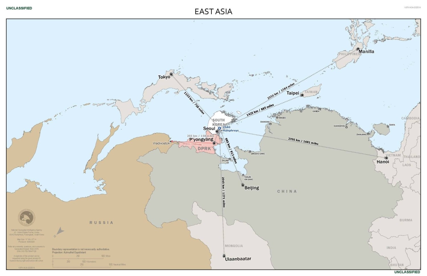
However, when following map directions, we align the map with the ground such that the top of the map is our direction, and is therefore emphasized. The orientation of this map emphasizes Korean proximity to US allies Japan, Taiwan, and the Philippines.

